March 14, 2016 | Deborah Harrison
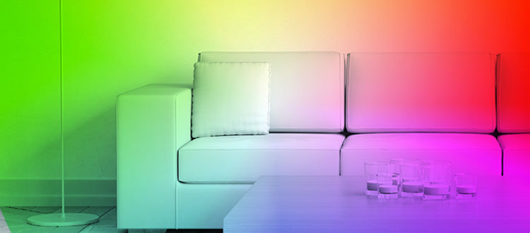
Colour therapy
How the right hue can change our moodsWith so many choices in paint colours, the hunt for the perfect hue can be a daunting task. And who could blame you? Most stores feature sample walls that have every colour under the sun – on one-inch-by-one-inch paint chips, to boot.
How do you convince yourself you're selecting the perfect colour? How do you commit to that one-inch teaser of colour for the next five years?
For myself, I always try to start with a hue I can build on. Then I bring more colours together on everything from trims and casings to carpets, linens or draperies.
When visiting the sea of colours, never ever go alone. Always take a piece of inspiration for the room along to confer with other colours. Use a white piece of paper for the backdrop – that's how you see the colour beside the colour.
Try not to be too "matchy matchy," with all your selections, instead adding colours as accessories that can cause a little tension in the room – something a little unexpected that gives the illusion you haven't tried too hard but still play well with others.
There is definitely a language of colour – a visual way of telling a story on a subconscious level. No words need be spoken, just the excitement felt when your guests see the eye candy for the first time.
"What I know to be true is to live creatively, we have to lose the fear of being wrong. Whether you use a time-honoured neutral or trending saturated hue, it will bring a sense of home because you chose it."
The most coveted colours seem to be the easy ones to live with. They are clean monochromatic modernisms or more earthy palettes that are viewed as more acceptable. They can be understated, serving a dual purpose of keeping colorations warm yet neutral.
They can help bring the outdoors in, helping to maintain a casual, serenity of nature. Blues and greens should always be seen, or purples and greens – colours of a lilac bush. It's nature's way of saying that two or more colours make sense together.
What's your favourite colour? What colour scares you or excites you? Is there a colour you always gravitate toward? Or you actually dislike? Colours can mean different things. Go to your colour wheel for help – or Mother Nature, if you prefer.
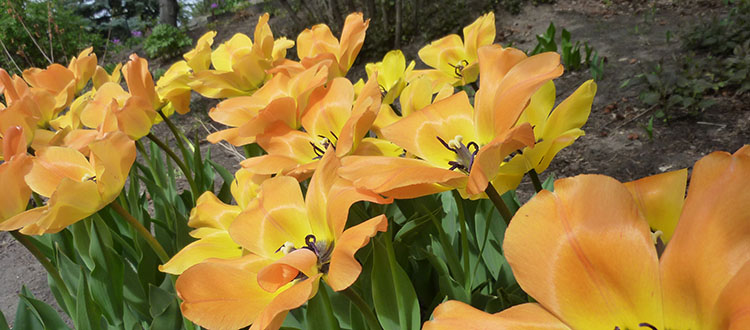
What about yellow?
Yellow is one of the trickiest colours to work with, having a multitude of undertones, especially when seen in directional natural light. Some yellows can look enthusiastic, such as lemon yellow. They can leave a sour taste in your mouth though – especially after painting an entire house and realizing it might be a little intense. Others are a bit more retro, such as banana yellow.
To temper your yellows, just add something black and it will create a chic colour scheme that always works. They say black, white and a little sunlight.
What colours mean
Yellow: Uplifting and joyful – a positive, inspiring colour. Yellow is one of the top hues chosen for a front door, creating a welcome invitation and representing creativity. It is also the most vivid of all colours in the spectrum.
That's why it is used for crosswalks – it's attention-grabbing. When choosing a shade of yellow, consider how sunny, spicy, warm, delicious and attention-grabbing you want it to be.
Red: Warmth, love, boldness, strength and passion – another fabulous colour for the front door.
Blue: Peace, calm, serene, exotic, fresh, inspiring and soothing. I have a crush on blue. It's the perfect colour for the fifth wall – your ceiling. BM Dew Drop is my go-to ceiling colour – a hint of a sunny sky.
Gray: A luxe colour with timeless quality at any end of the spectrum. Remember, too much of a red undertone can make it appear purple.
Black: The most sophis-ticated, elegant and luxurious of them all. Black is the grounding colour of any room. It's serious and powerful. The total absence of colour can be beautifully spilled into the room with woods, metals, or tile. A little goes along way.
People don't realize how much colour impacts the way you feel and interact in a space. Tranquil colours are soothing and relaxing. Save the tranquil colours for the bedrooms. (Saturated colours, meanwhile, can infuse a room with energy.)
There is really no limit or rule to how often or how much to use your ideal colour once you've finally found it. If you want to introduce it repeatedly, it will give you a cohesiveness to your home. Just don't rely on that colour in paint. Instead, depend on infused patterns, prints and artwork to repeat it.
What I know to be true is to live creatively, we have to lose the fear of being wrong. Whether you use a time-honoured neutral or trending saturated hue, it will bring a sense of home because you chose it.
Be perceptive. Notice the colours around you and how they make you feel. The most important thing is to choose it because you love it. And remember, it's only paint!
Deborah Harrison is an interior designer with Inside Out Design. Send your thoughts, ideas and inspirations to soulifydesign@gmail.com.
Tagged: colours | Deborah Harrison | Guest Column | Home Design | paint | Renovation | YYCRE


Related Articles
